Multiple linear regression is just like simple linear regression, but instead of using only one independent variable \((X)\) to predict the outcome \((Y)\), it uses two or more independent variables at the same time. Each independent variable gets its own coefficient ( \(β_1, β_2, β_3...\) etc.), representing its unique effect on the dependent variable while keeping the others constant. This allows you to see how each factor influences the outcome, controlling for the others.
So for a model with \(p\) independent predictor terms, the model now takes the form:
\[y=β_0+β_1x_1+β_2x_2+β_3x_3+...+β_px_p+ε\]As you can see, it gets to be a bit much to write out this long-form notation, hence the beauty and value of the alternative matrix approach. Recall that in addition to describing a linear regression model with a simple algebraic linear equation like \(y=β_0+β_1x_1+ε\) our model can also be expressed using matrix notation as:
\[
Y=Xβ+ε
\]
While up until now we’ve only worked in the situation where \(X\) is an \(n\times 2\) matrix with the first column full of 1s to correspond to the intercept term, there is no reason \(X\) can’t be \(n\times (p+1)\) where \(p\) is any number of parameters we’d like to include in our quest to model \(Y\). All we need to do is expand \(β\) to be \((p+1)\times 1\) to match.
The matrix approach to solve for \(\hatβ\) is still calculated by:
\[
\hatβ=(X^TX)^{-1}X^TY
\]
This of course means that the solution for \(β\) still requires \(X^TX\) have an inverse. No inverse, no \(\hat{β}\), no matter the dimensions.
What does this look like in practice? Consider the hills data set in the MASS library that contains the winning times for 35 Scottish hill races in 1984. These races range from a greulling 16km length with a climb of 7500 meters that takes hours to simpler runs of 3km rising 300 meters that are done in under 20 minutes. Since both distance and elevation change obviously play a role in the challenge presented by a race, it would make sense to include both distance and climb in a model predicting the winning time. We want a model that looks like:\(winning \space time=β_0+(β_1\times distance) + (β_2 \times climb) + ε\).
The approach to using and interpreting this model is similar to if only one predictor term was used. To use it for prediction, we just plug in values of \(x_1\) and \(x_2\) and note the resulting \(y\). For example, to estimate the winning race time for a new race that’s 10km with an elevation change of 3100m, our our model would suggest \(-8.992+(6.218\times 10)+(0.011\times 3100)=87.436\) minutes. The intercept tells us the winning race time expected for a hypothetical race that is 0km long with 0m climb: an end almost 9 minutes before the race begins. Not a meaningful answer but not a possible real race either. Our slopes are now in two different dimensions making for a fit plane in 3-dimensional space rather than a fit line. It also makes a plot of the data and the fit hard to do. Interpreting the slopes one by one we see that each additional km of distance adds, on average, about 6.2 minutes to the finishing time and each additional meter of climb adds, on average, 0.011 minutes which is less than one second.
7.2 Variance and Inference for \(\hat\beta\)
For standard errors in multiple regression we’ll continue with the matrix notation for our model and rely more on your linear algebra skills. Start with:
\[
\hatβ=(X^TX)^{-1}X^TY
\]
Since our model is based on \(Y=Xβ+ε\) we can then plug in \(Xβ+ε\) for \(Y\) to get:
\[\hatβ=(X^TX)^{-1}X^T(Xβ+ε)\] which reduces to
\[\hatβ=β+(X^TX)^{-1}X^Tε\]
thanks to \((X^TX)^{-1}X^TX=I\). Unlike our estimate \(\hatβ\), the parameter \(β\) is an unknown constant and therefore has zero variance. This means \[var(\hatβ)=var((X^TX)^{-1}X^Tε)\]
A property of random vectors says that if \(A\) is a matrix and \(v\) a random vector, then \(var(Av)=A var(v)A^T\). Applying that, we now can express \(var(\hatβ)\) as:
Recall one of our big assumptions is that \(Var(ε)\) is constant. As part of that, we denote \(Var(ε)\) as simply \(\sigma^2I\) where \(\sigma\) is that constant variance. So now:
This is what R is doing under the hood when it produces your column of standard errors for the model summary output. This holds whether \(\hat\beta\) is a simple \(2\times1\) vector with an intercept and slope for a single predictor like we saw back in Chapter 3, or whether \(\hat\beta\) is a much larger \((p+1)\times1\) vector with an intercept and slopes for \(p\) predictors.
An example demonstrating this in R on the hill race model:
xmat<-matrix(c(rep(1, nrow(hills)), hills$dist, hills$climb), ncol=3)sigma<-summary(mod_hills)$sigmavar_b<-(sigma^2)*solve(t(xmat)%*%xmat)#diagonal is the variance of each beta, off-diagonals are covariancesvar_b
Why does variance of \(\hat\beta\) matter? Inference in multiple regression is just like inference in the single-predictor simple linear regression with confidence intervals that take the form of:\[
point\: estimate \pm multiplier\times standard \: error
\]and hypothesis test statistics have the general format of:
\[
\frac{observed \: value - hypothesized\: value}{standard\: error}
\]
so obviously standard error is a key element of both. Confidence intervals for each \(\beta\) coefficient can be estimated from \(\hat\beta_i \pm t_{\alpha/2}\times SE_{\hat\beta_i}\) where \(t\) has \(n-(p+1)\) degrees of freedom and tests of \(\beta_i=0\) have a test statistic of \(t=\hat\beta_i/SE_{\hat\beta_i}\) with p-values calculated from a \(t_{n-(p+1)}\) distribution.
The easiest way to do confidence intervals for \(\beta\) in R is still the confint function as seen earlier with single predictor models.
For hypothesis tests on \(\beta\), all of the information you need for the most common test of \(H_0:\beta_i=0\) is given in the model summary output. If instead you are interested in testing \(H_0:\beta_i=b\) for some value \(b\), you can simply calculate your test statistic from the standard error as given in the model summary table, and the corresponding p-value using the pt function. For example, if we wanted to test the hypothesis that each additional km of distance added an average of more than 5 minutes to the race time, that would be testing \(H_0:\beta_{dist}\leq5\) with \(H_A:\beta_{dist}>5\). The test statistic would be calculated as:
#using estimate and std. error for dist:t_stat<-(6.217956-5)/0.601148#find upper tail since alternative is upper tailpt(t_stat, nrow(hills)-3, lower.tail =FALSE)
[1] 0.02558215
With an \(\alpha=0.05\), this is sufficient evidence that the mean increase in race time for every additional km of distance is indeed greater than 5 minutes.
7.3 Variance and Inference for fitted Y
Recall \(\hat y=X\hat\beta=Hy\) where \(H=X(X^TX)^{-1}X^T\) and is known as the “hat” matrix. Therefore, \(var(\hat y)=Hvar(y)H^T\) using the same property applied in Equation 7.2. Fun fact about \(H\): it is both symmetric and idempotent. This means \(H=H^T\) and \(HH=H\). Assuming \(Y\) is distributed \(N(X\beta, \sigma^2)\) we can then plug in \(\sigma^2I\) for \(var(y)\) yielding:
\[
var(\hat y)=\sigma^2H
\]
which means the variance for any specific fitted \(\hat {y_i}\) is:
\[
var(\hat y)=\sigma^2h_{ii}
\tag{7.3}\]
the variance of y, multiplied by the \(i^{th}\) diagonal of the hat matrix.
This is great, but more often in regression we aren’t interested in just the variance of specific fitted values for the data set the model trained on. Usually un-observed \(x^*\) values are plugged in to our fitted model to estimate additional \(y\) outcomes. When that’s the case there is no \(h_{ii}\) that applies. This takes us back to \(\hat y=X\hat\beta\) but now instead of the full \(X\) we only have the vector \(x_*\) so:
\[var(\hat y_*)=\sigma^2 x_*^T(X^TX)^{-1}x_*\] This is the same as formula you saw for the simple linear case back in chapter 3: \[
SE_{\bar{Y}|x_*}=S_R\sqrt{\frac{1}{n}+\frac{(x_*-\bar{x})^2}{\sum{(x_i-\bar{x})^2}}}
\tag{7.4}\]
The matrix algebra is what’s going on behind the scenes in R no matter how many predictors you have. Writing it out longhand as in Equation 7.4 is much harder to do for multiple predictors, but seeing it that way for the simple case makes it easier to see that when \(x_*\) values are close to the mean \(x\) values the standard error is smaller making the resulting intervals narrower.
The predict function used for confidence and prediction intervals for \(y_*\) in the simple linear case continues to do the job for multiple regression models.
Consider the 90% prediction intervals below for a race with a distance of 7km and climb of 1800m (values near the respective means) and a race with a distance 23km and a climb of 6000m (more unusual but within the range observed in the training set).
The race first race has a narrower interval because it involves \(x_*\) nearer the center of the training \(X\) values.
7.4 Transformations
7.4.1 Units change on one term
We begin with the simplest type of transformation on a single predictor: a unit change. Maybe meters of climb isn’t the unit of measurement we want to use for climb in our hill racing model. Let’s change it so that we can get the amount of time added per km of climb so that the units on climb will match the units on distance. That means instead of what we saw earlier in Equation 7.1 now:
Which makes perfect sense and behaves just as we saw in the simple linear example from Chapter 5: we divided our \(x_2\) by 1000, so to get the same result from \(β_2 \times x_2\) the value of \({β_2}\) would need to increase by a factor of 1000. And now our interpretation includes that the winning time increase by about 11 minutes on average for every km of climb added.
Any time you want to make a units change on a predictor term the \(β\) estimate for the associated variable will simply change by the inverse and all other β will be unaffected. Standard errors will change in scale as well which will leave you with parameter test statistics and p-values that are unchanged. The quality of your fit as measured by \(R^2\) won’t change at all either so use whatever scales you’d like predictor by predictor.
7.4.2 One or more X terms
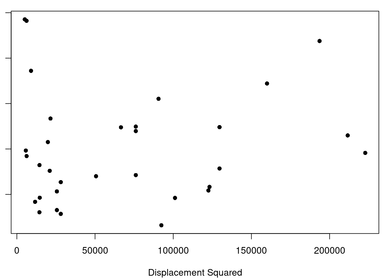
(a) Displacement Squared
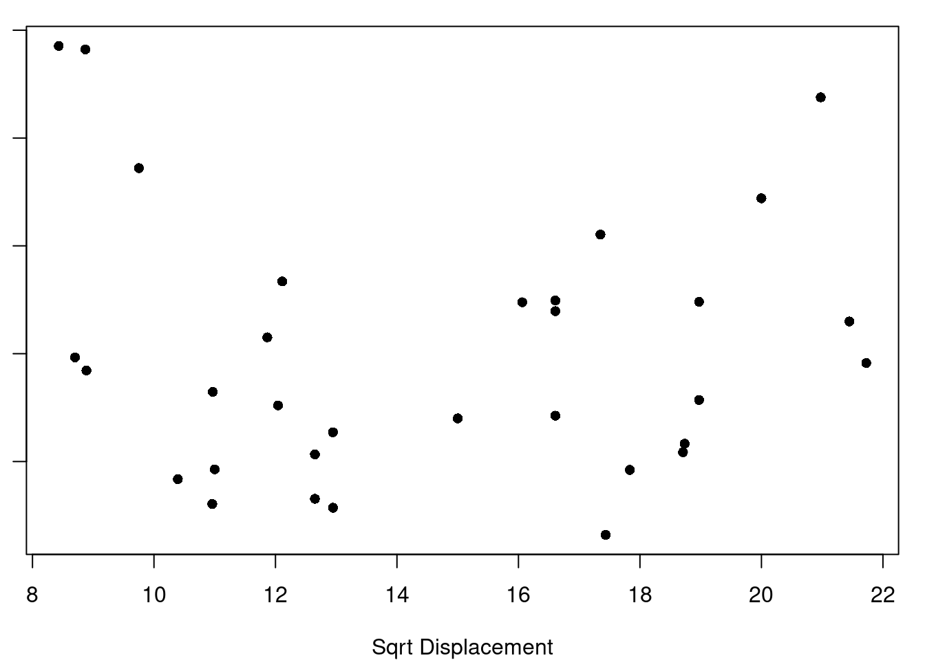
(b) Square-root Displacement
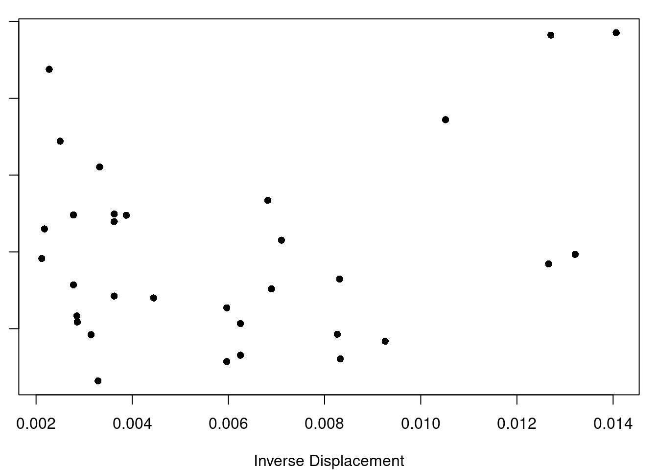
(c) Inverse Displacement
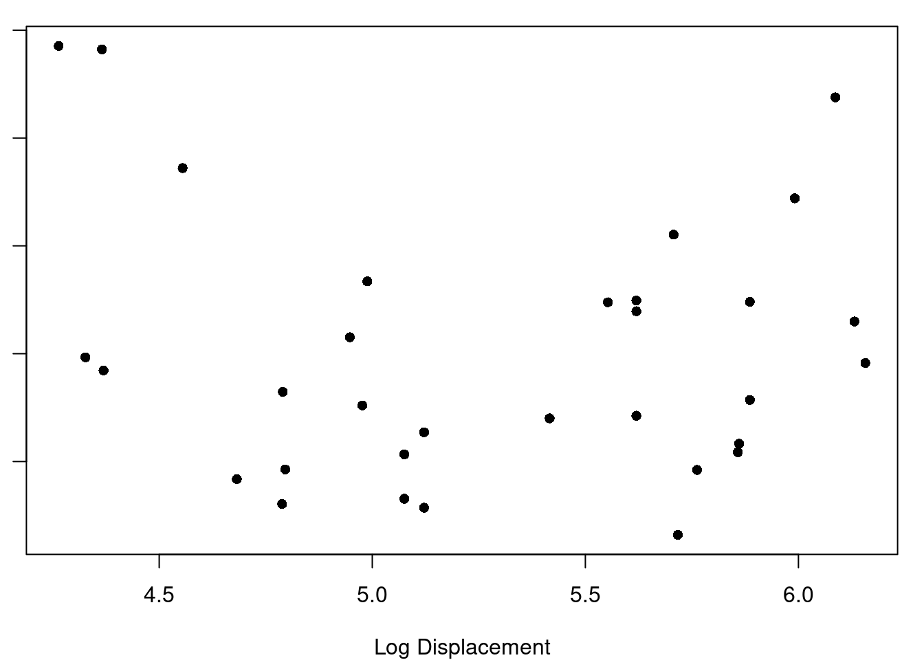
(d) Log Displacement
Figure 7.1: Displacement Transformations and Residuals
(a) Model with Displacement^2 plus HP, Axle Ratio, and Wt
Figure 7.2: Motor Trend Car Data
(a) Log(dist) vs. residuals of time~climb
(b) Log(climb) vs. residuals of time~dist
Figure 7.3: Scottish Hill Races, Log transformations
7.4.3 Transforming Y
Why would you want to transform Y instead of one or more of your X terms? Well, what if what you really want for the format of your model is \(y=e^{\beta_0+x_1\beta_1+x_2\beta_2+\epsilon}\) ? You aren’t able to fit that type of relationship directly with the least-squares regression methods we’ve covered, but you could use a log transform on y and then fit \(log(y)=\beta_0+x_1\beta_1+x_2\beta_2+\epsilon\) without any trouble. Generally, any time you think the relationship at hand is of the form \(y=f(\beta_0+x_1\beta_1+x_2\beta_2+\epsilon)\) the solution is to transform your \(y\) with \(f'\) and fit the \(f'(y)=\beta_0+x_1\beta_1+x_2\beta_2+\epsilon\) model.
7.5 Plotting for Multiple Regression
While the basics of fitting a model and using it for inference are largely unchanged from our simple linear regression modeling, expanding beyond one independent predictor variable in our model makes plotting the data more complicated (but also more vital). It’s more complicated because we can generally only plot two continuous dimensions at a time (in a way our brains can understand) simply because our screens (and paper) are two-dimensional, but more vital because there are now even more nuances to the relationships of the variables that we need to know about.
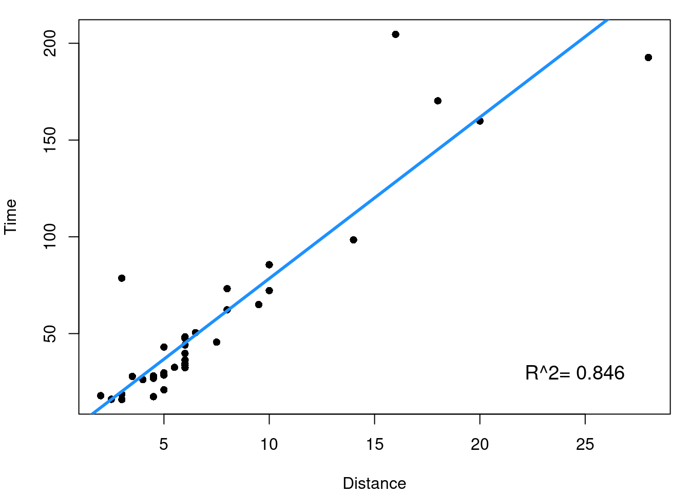
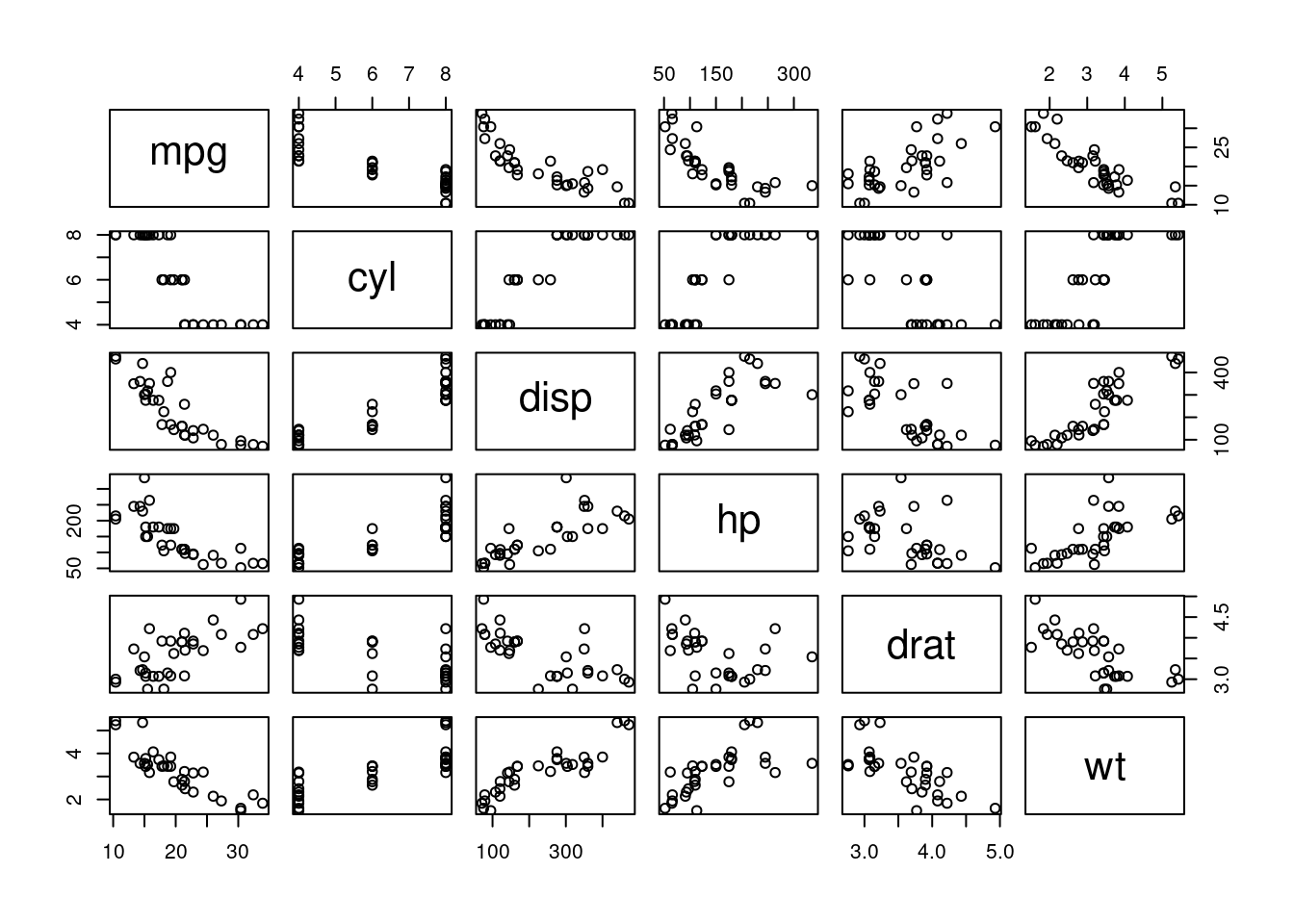
A good first step is to look at the simple pairwise relationships between each indpendent \(x\) predictor and the dependent outcome \(y\). This means for the hill data we’d consider the plots shown in Figure 7.4.
(a) Distance and Time
(b) Climb and Time
Figure 7.4: Scottish Hill Race Data
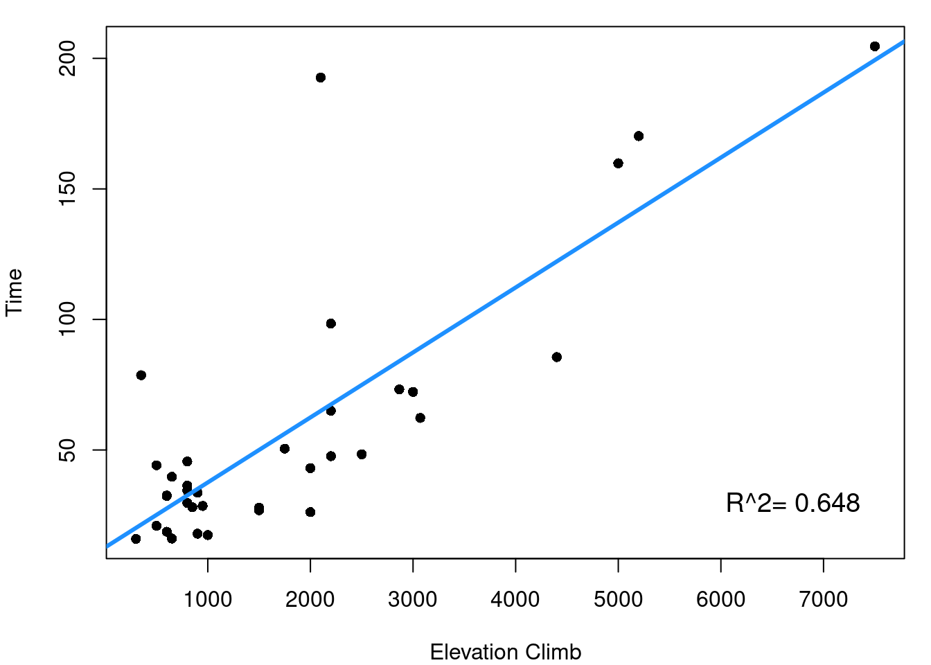
From Figure 7.4 it is clearly seen that both the distance of the race and the elevation climb of the race are reasonably linearly related to our outcome of race record time. \(R^2\) values for the two simple linear models tell us that distance alone explains 84.6% of the variability in race time and elevation climb explains 64.8% of race time variability. The next step now is to consider how your independent variables relate to each other.
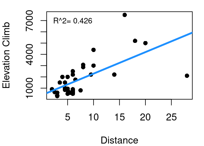
Figure 7.5: Scottish Hill Race Distance and Elevation Climb
This is the relationship shown in Figure 7.5. As one might expect, race distance and elevation change are related to each other. This makes intuitive sense since longer races have greater opportunity for changes in elevation. You aren’t going to have a race that increases 3000 meters in elevation but is only 1 km long - that’s just too steep to be at all safe (or enjoyable). The \(R^2\) of a linear model predicting climb as a function of distance is 42.6%. Why is this important when working to predict time? Well if distance gets us 84.6% of the way to explaining time, and climb gets us 64.8% of the way to explaining time, clearly there must be some overlap in the value they offer since 0.846+0.648>1. The 42.6% is a measure of the overlap.
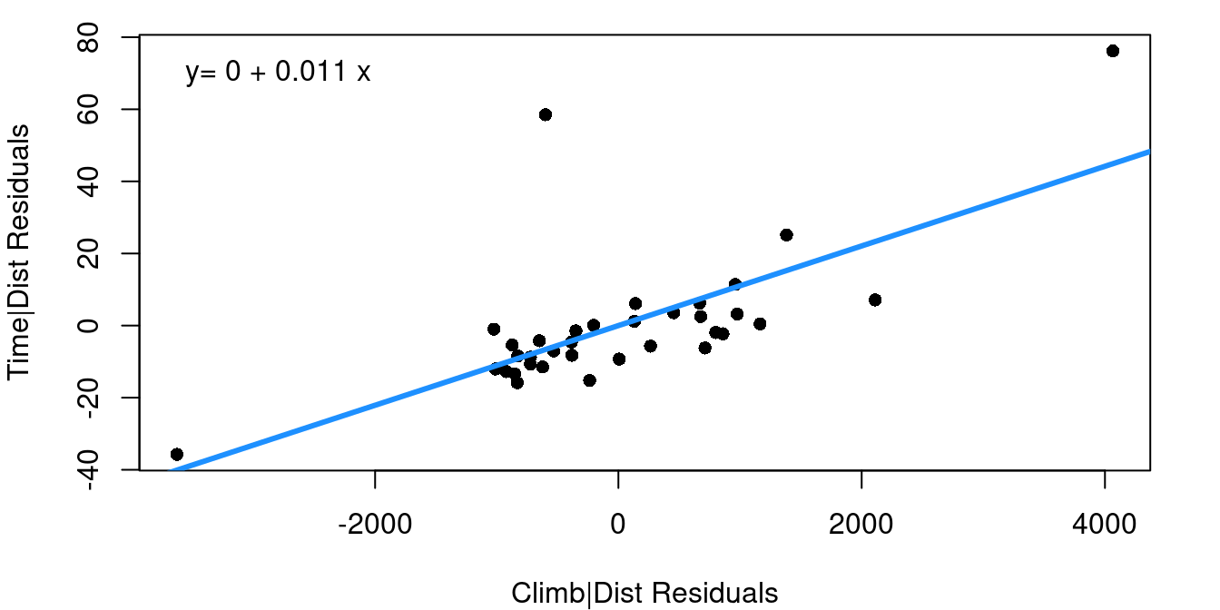
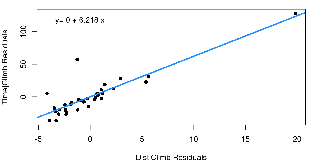
The Added Variable Plot, also sometimes referred to as a Partial Regression Plot, is a tool for capturing how much value an additional independent variable offers in predicting your dependent variable. The plot contains the residuals from two different linear models. First, the x-axis is the residuals from a model predicting \(x_2\) using \(x_1\). Then, the y-axis is the residuals of a model predicting y using only only \(x_1\). To put this another way, the added variable plot shows the relationship between the variability of your possible new predictor term given the existing predictor compared to the variability that remains in your dependent variable after the first predictor is considered.
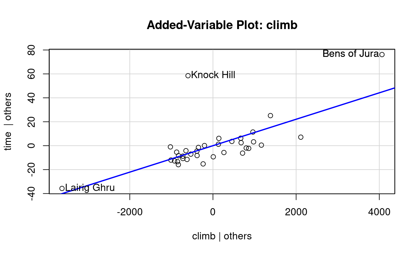
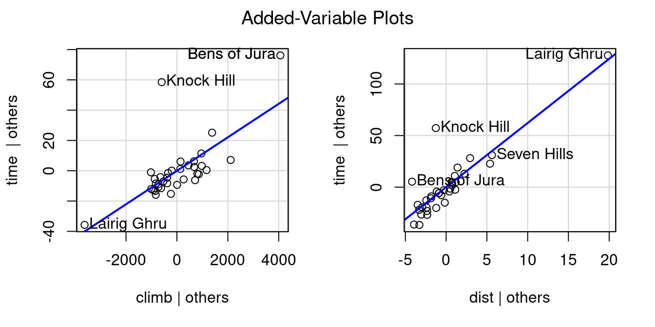
(a) Adding Climb to Distance Only
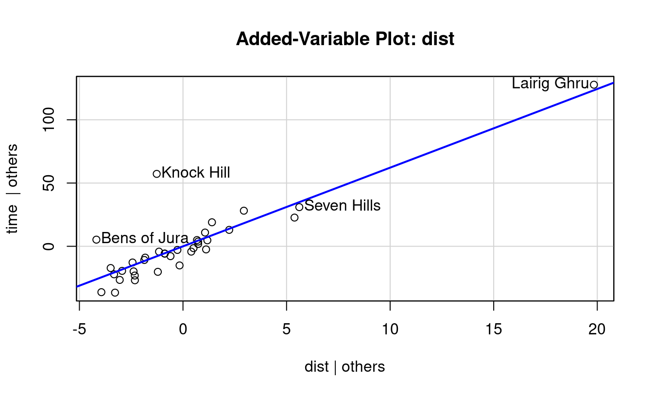
(b) Adding Distance to Climb Only
Figure 7.6: Added Variable Plots
Figure 7.6 shows two added variable plots. Figure 7.6 (a) shows the plot assessing the value climb offers in predicting time after distance, and Figure 7.6 (b) assesses the value of adding distance if climb was included first. Equations of the least-squares regression lines are given in the top left corners.
Note that the equations both have an intercept of zero. That’s because, as you should recall, 1) fitted regression lines always pass through the mean of X and the mean of Y, and 2) our X and Y in these cases are both residuals and the mean residual from a linear regression model is always zero. The slopes from these fits are worth noting though.
When the multiple regression model is fit including distance and climb together, notice the slopes for the distance and climb terms exactly match the slopes from the added variable plots.
Now let’s expand beyond our two-predictor hill race model and look at a larger data set with multiple predictors. Figure 7.7 shows a scatterplot matrix for the first 6 columns of the mtcar data frame we’ve worked with earlier.
Figure 7.7: Motor Trend Car Data
Across the top row you can see that all of the available independent variables are strong potential predictors of fuel efficiency (MPG). Some terms may warrant some transformation given apparent curvature in the mpg-displacement and mpg-hp plots, but all indicate they could be useful in a model for MPG. Other scatterplots in the matrix show us that many of these terms are closely related to each other as well so we know there is overlap in the value they offer to predict MPG.
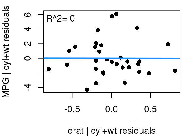
We start with the model \(mpg=β_0+β_1wt+β_2cyl+ε\) because vehicle weight and the number of engine cylinders should have the strongest influence on fuel efficiency. From there, the question is how much would our model improve if drat, the rear axle ratio, were added? From our initial scatterplot matrix drat’s relationship with mpg appears reasonably linear so there shouldn’t be any transformations to worry about.
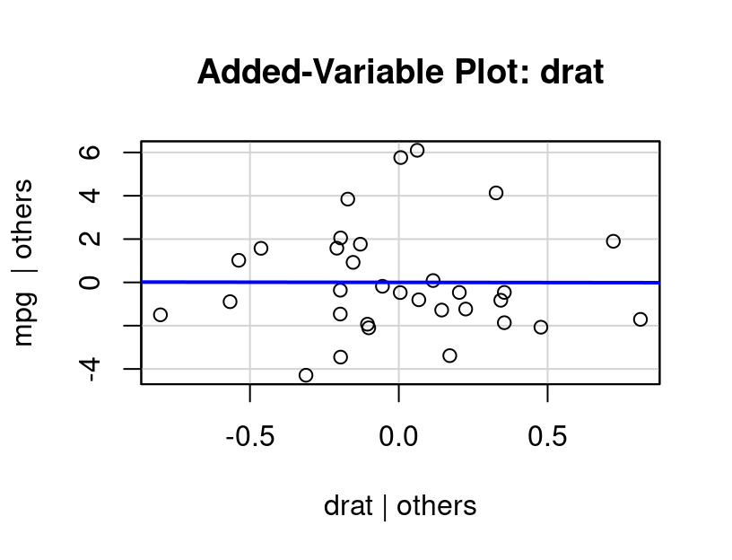
Figure 7.8: Added Variable Plot, Rear Axle Ratio
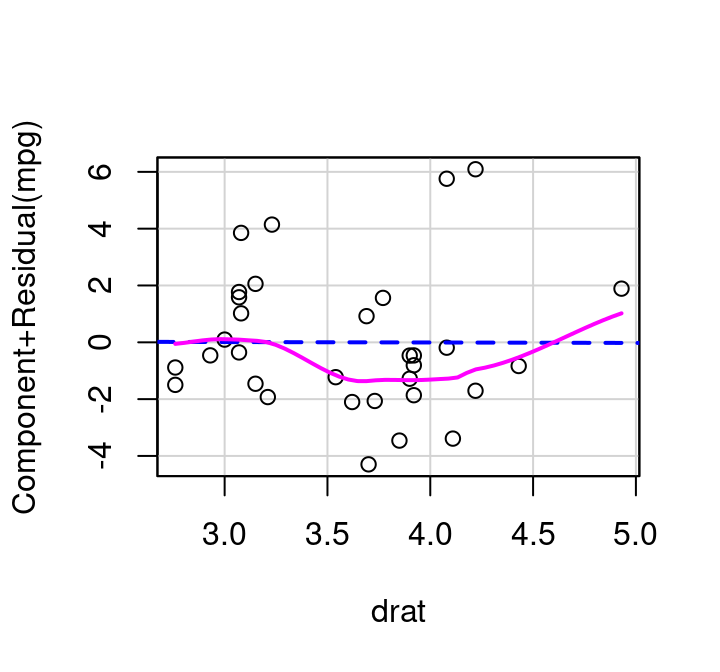
The added variable plot for drat given in Figure 7.8 shows that there is no real additional value that drat offers when cylinders and weight are already in the model. The relationship between the residuals from drat modeled by cylinders+weight and the residuals of mpg modeled by cylinders+weight appears completely random; has a best fit line that is virtually horizontal, and a correlation that is zero.
After seeing this plot, it should come as no surprise that when a model is fit predicting MPG as a function of cylinders+weight+axle ratio the axle ratio term is not statistically significant.
Figure 7.4 and Figure 7.8 show added variable plots put together manually using basic plotting functionality in R. There’s also the avPlot function in the car library that will produce added variable plots directly with much less effort. All you need to specify in avPlot is the name of the full fitted model object, and the name of the variable you want to consider as the possible add/drop term. The variable name needs to be put in quotation marks. First, an example using the avPlot function on the hill race data:
If you want to quickly produce all added variable plots for a model, you can use the avPlots command. Just add that s to the command name and simply providing the model object will create all plots.
avPlots(mhills)
7.5.2 Partial Residual Plot
There’s another useful plot to know about when working with multiple regression: the Partial Residual Plot. A partial residual plot is another way to look at how each predictor plays a role in a model with multiple independent variables.
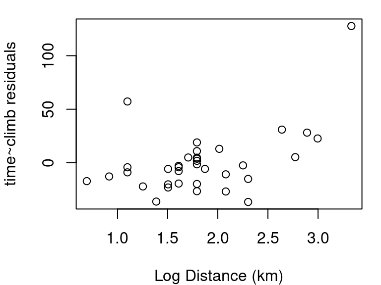
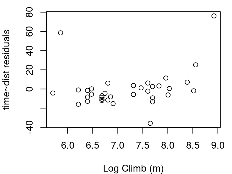
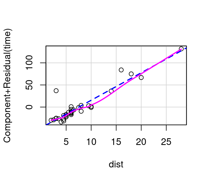
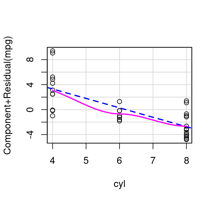
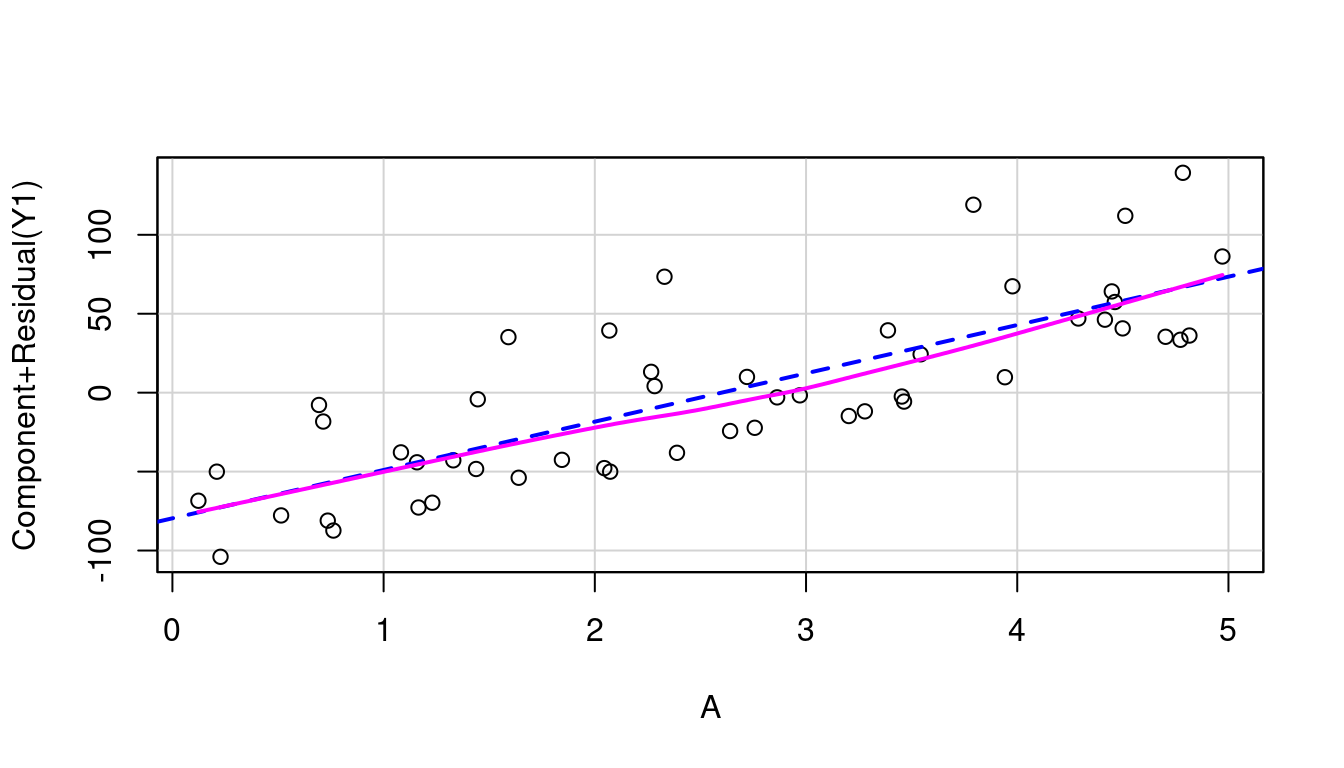
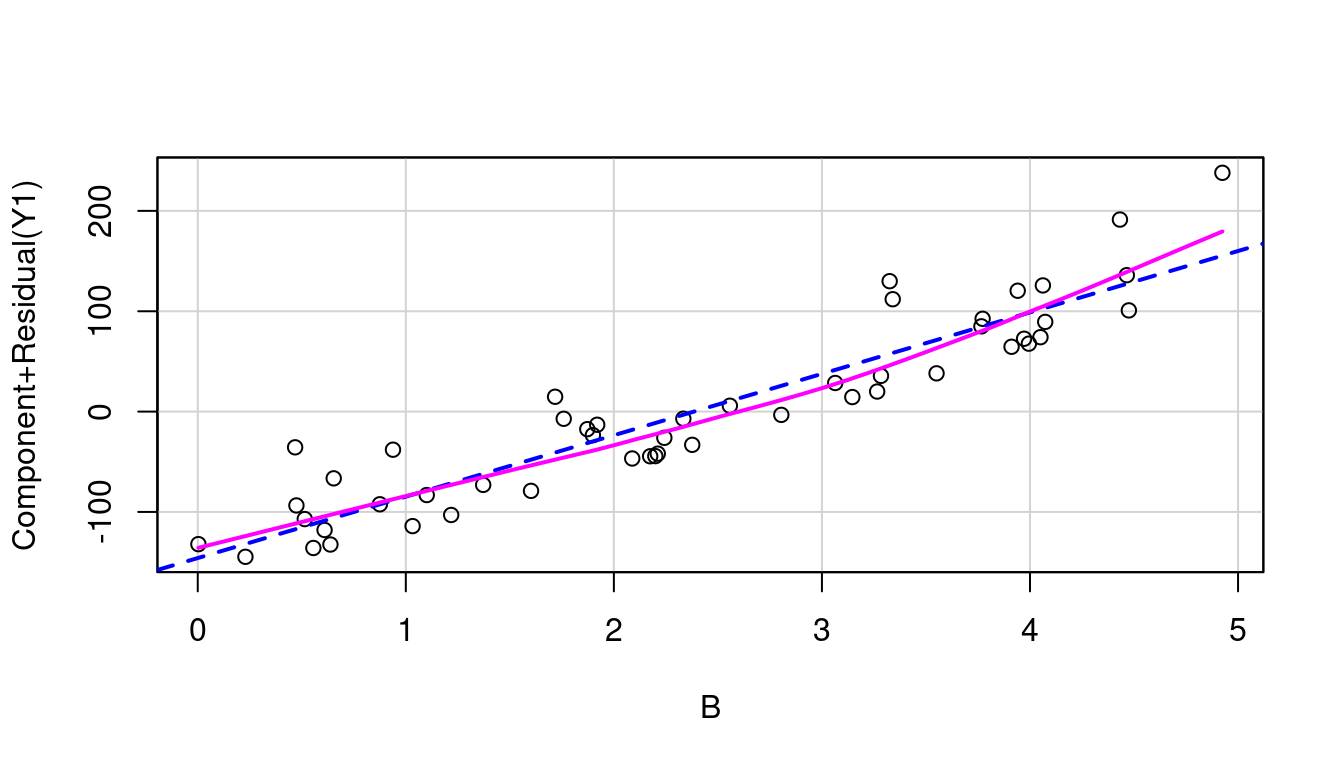
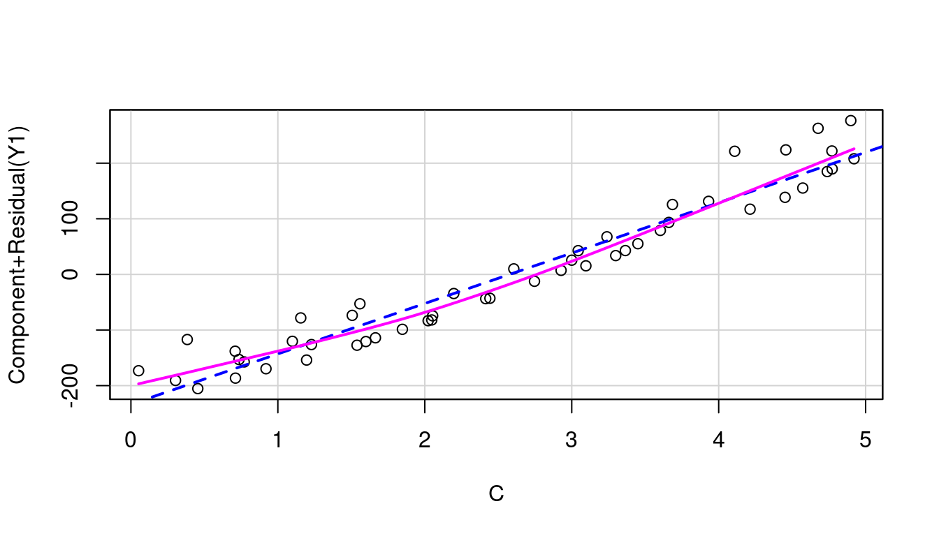
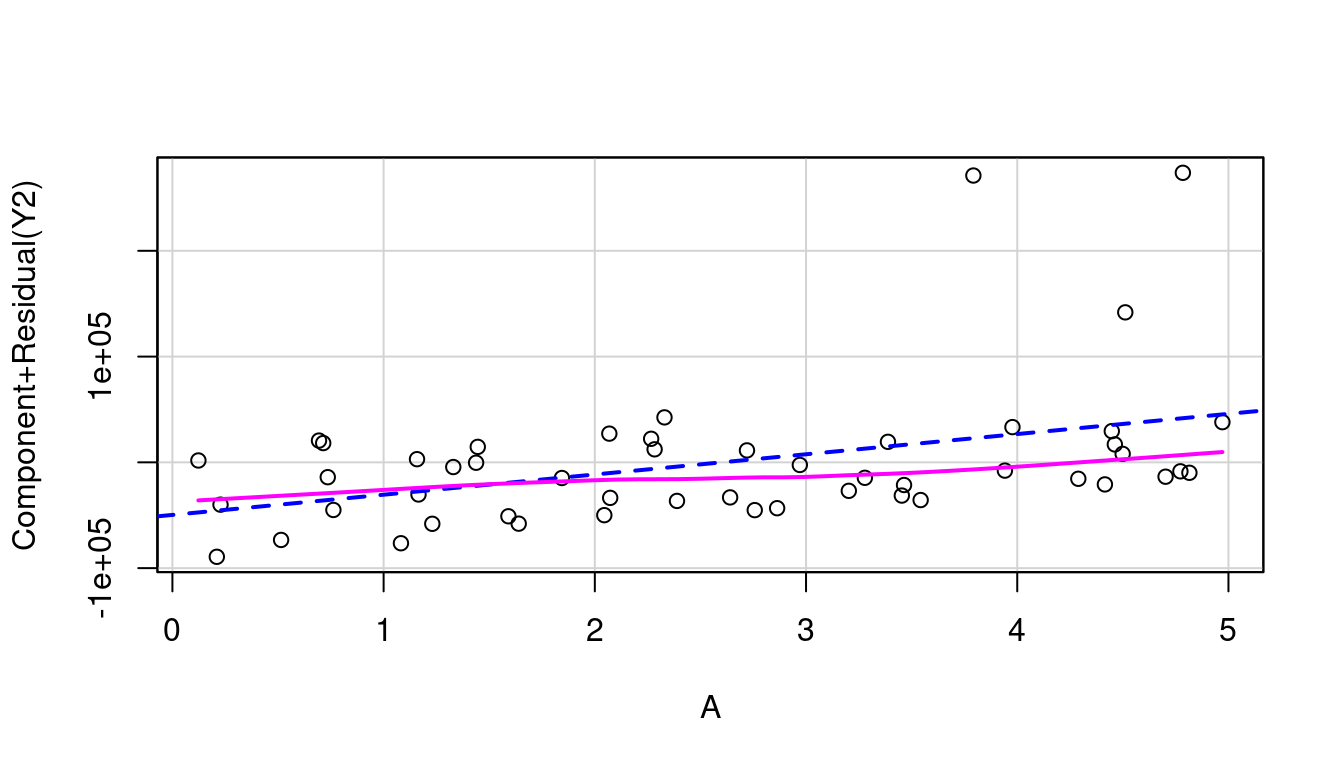
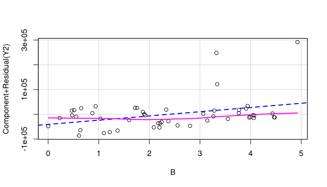
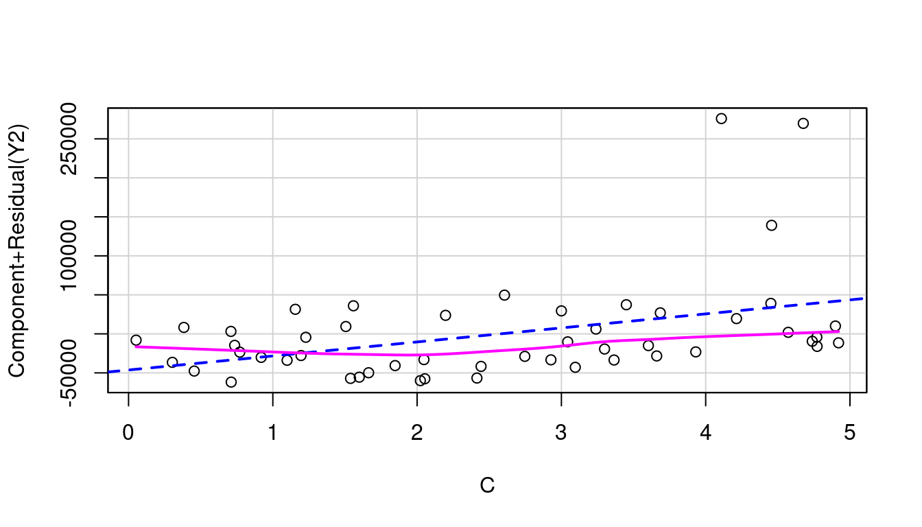
To investigate \(x_i\) using a partial residual plot, first fit a model with all independent terms of interest included. The x-axis is then \(x_i\), and the y-axis is the residuals from your full model \(+β_ix_i\). Figure 7.11 shows these plots for distance and elevation climb as predictors for race time in the hill race data. The partial residual plots produced by R by default have two helpful overlaid lines: a dashed blue line showing the best linear fit, and a more free-form line showing the pattern followed by the points.
(a) Distance
(b) Elevation Climb
Figure 7.11: Partial residual plots, Hill Races
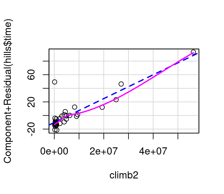
In this example, the pink line for distance follows the blue dashed line fairly well as shown in Figure 7.11 (a). The curvature shown in the pink line for the partial residual plot for climb in Figure 7.11 (b) however, indicates a transformation on climb might make for an even better model. Specifically, it appears that squaring climb might straighten the relationship out.
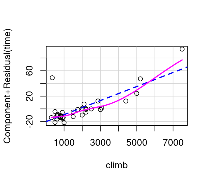
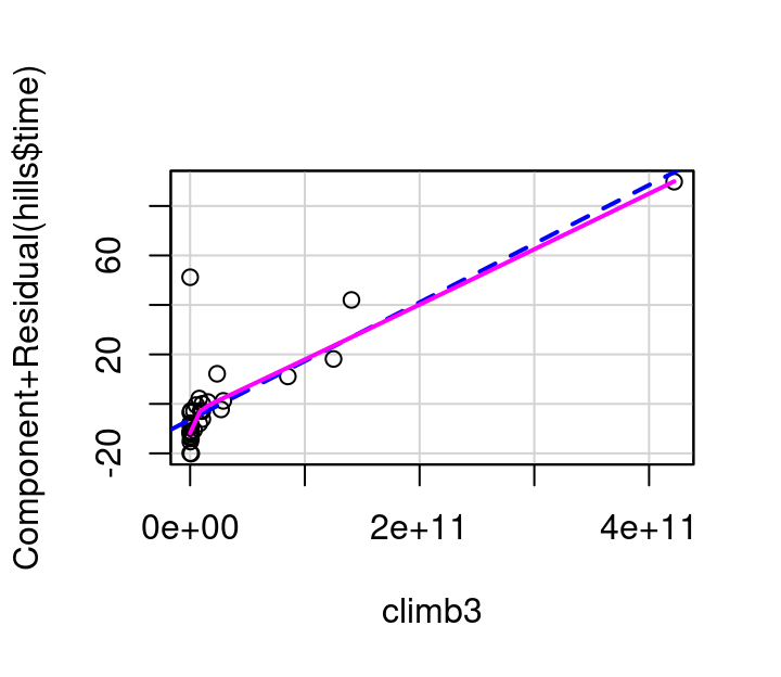
To investigate this, consider the plots in Figure 7.12 showing (a) the partial residual plot when \(climb^2\) is used in the model and (b) the partial residual plot when \(climb^3\) in the model. The \(climb^2\) model is a definite improvement over the original, but still not quite right. The \(climb^3\) model straightens the pink curve further to the point that it aligns nearly perfectly with the dashed blue line.
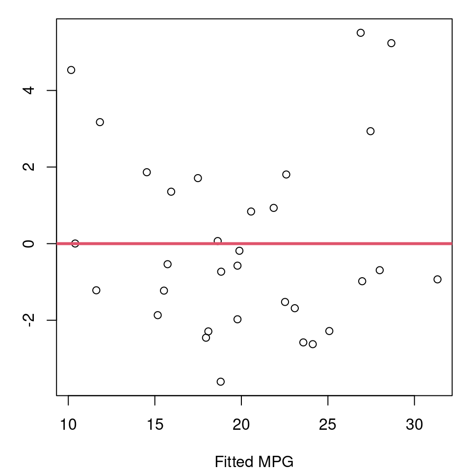
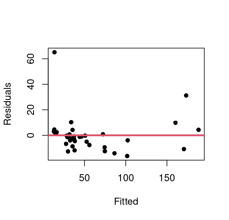
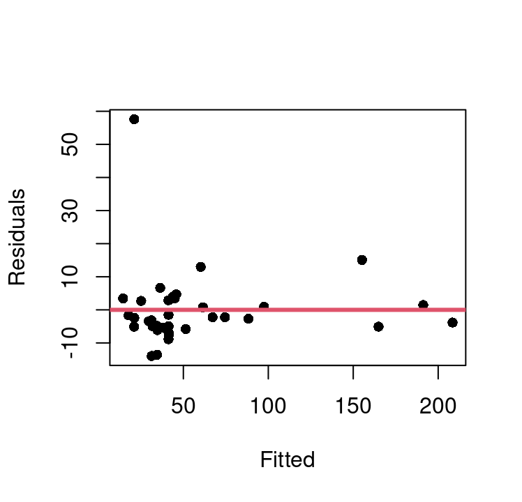
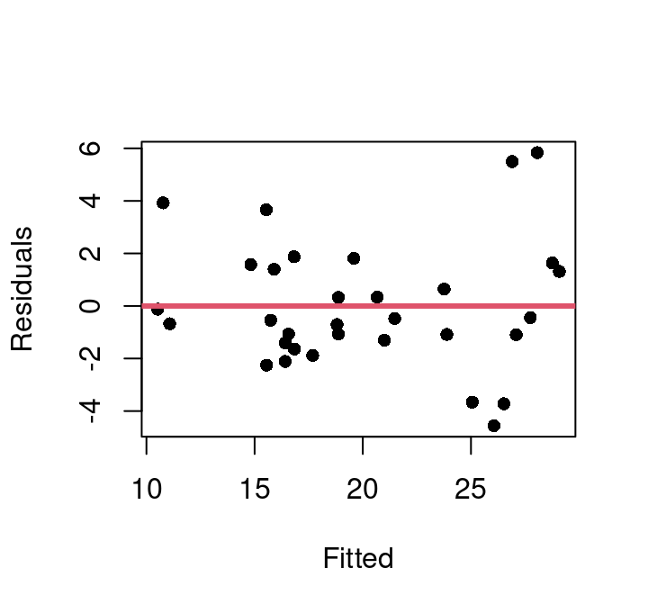
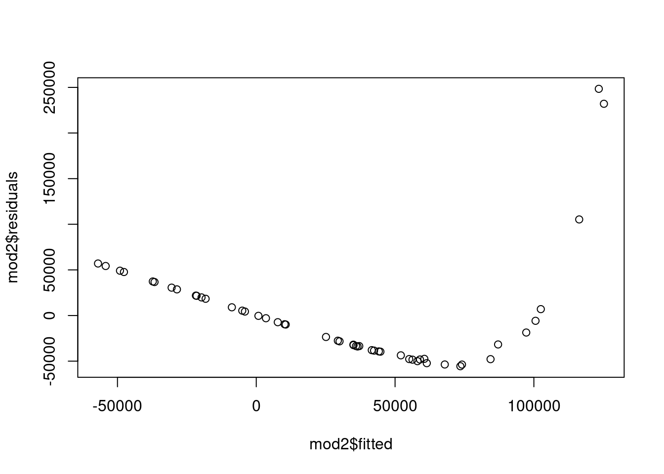
Using this, we can update our model for winning time to use \(climb^3\), and then evaluate the fit and model assumptions. Figure 7.13 shows the fitted vs. residual plots for both the basic model with \(climb\) directly and the approach and the \(climb^3\) model.
(a) Dist + Climb model
(b) Dist + Climb\(^3\) model
Figure 7.13: Fitted vs. Residual Plots
This shows there is one extreme outlier with a residual greater than 50 that is present in both approaches. We can also see that the basic model does exhibit some curvature that appears fully corrected in the \(climb^3\) model. Homoskedasticity appears much improved in the new model as well.
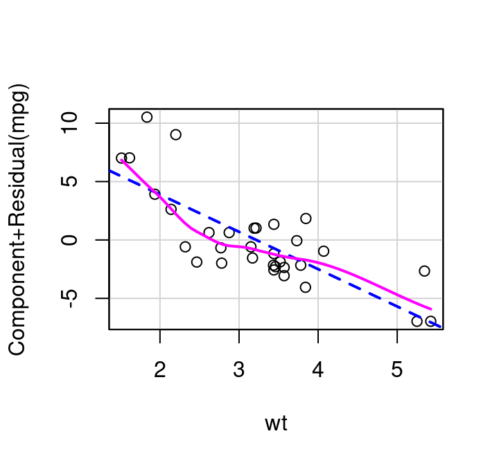
How do partial residual plots look for our more complex mtcars example? Consider Figure 7.14. The plot for weight shows slight, but non-consistent deviation from the line. The plot for cylinders suggests perhaps a simple transformation might improve the fit. And the plot for drat, the measure of the rear axle ratio, definitely shows curvature away from a horizontal line. This horizontal line confirms what we saw with the added variable plot: inclusion of the term won’t significantly help predict MPG at all.
(a) Cylinders
(b) Weight
(c) Rear Axle Ratio
Figure 7.14: Partial Residual Plots
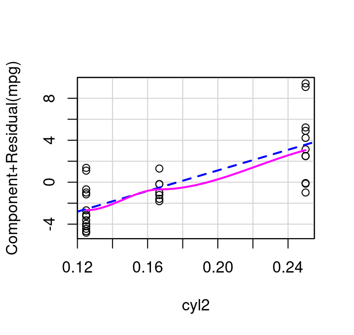
If cylinders is transformed to be included in the model as \(1/cylinders\) then the updated partial residual plot becomes what is shown in Figure 7.15 (a) and the resulting fitted vs. residual plot for the weight+inverse cylinders model is as shown in Figure 7.15 (b). The \(R^2\) of the model fit with cylinders inverted is very slightly increased over the initial model with simply weight+cylinders, 0.837 vs 0.830, making it a matter of scientist discretion if the added complexity of inverting cylinders is worth the minimal fit improvement.
(a) Inverse Cylinders Partial Residual Plot,Fitted vs. Residual
(b) Inverse Cylinders Partial Residual Plot,Fitted vs. Residual
Like the avPlot function, the partial residual plot function is in the car library. crPlot creates the partial residual plots with a minimum of two inputs: the full fitted model object, and the name of the variable you want to focus on. Make sure you put the variable name in quotation marks.
As seen with avPlot, there is also a plural version of the crPlot command. crPlots will create all possible partial residual plots for a specified model. Where does the name “crPlot” come from? The y-axis is the component of interest plus the model residual: “cr” is short for “component + residual”.
7.5.3 Inverse Response Plot
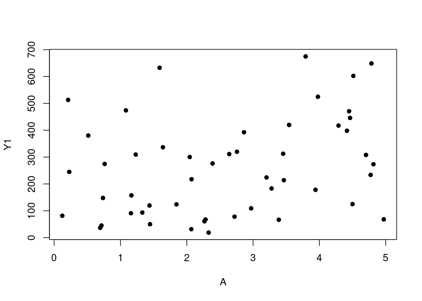
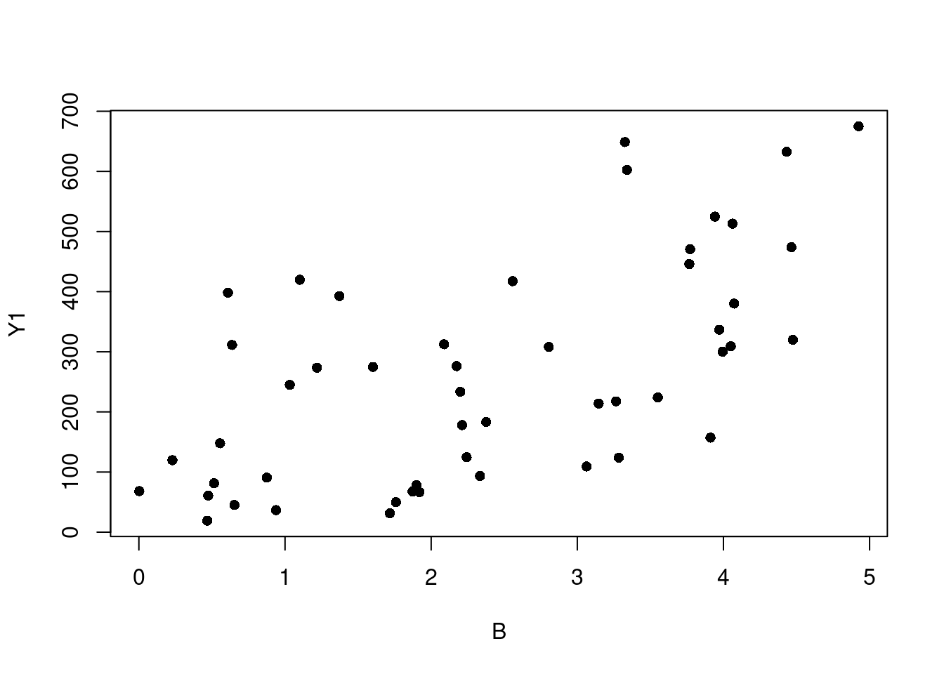
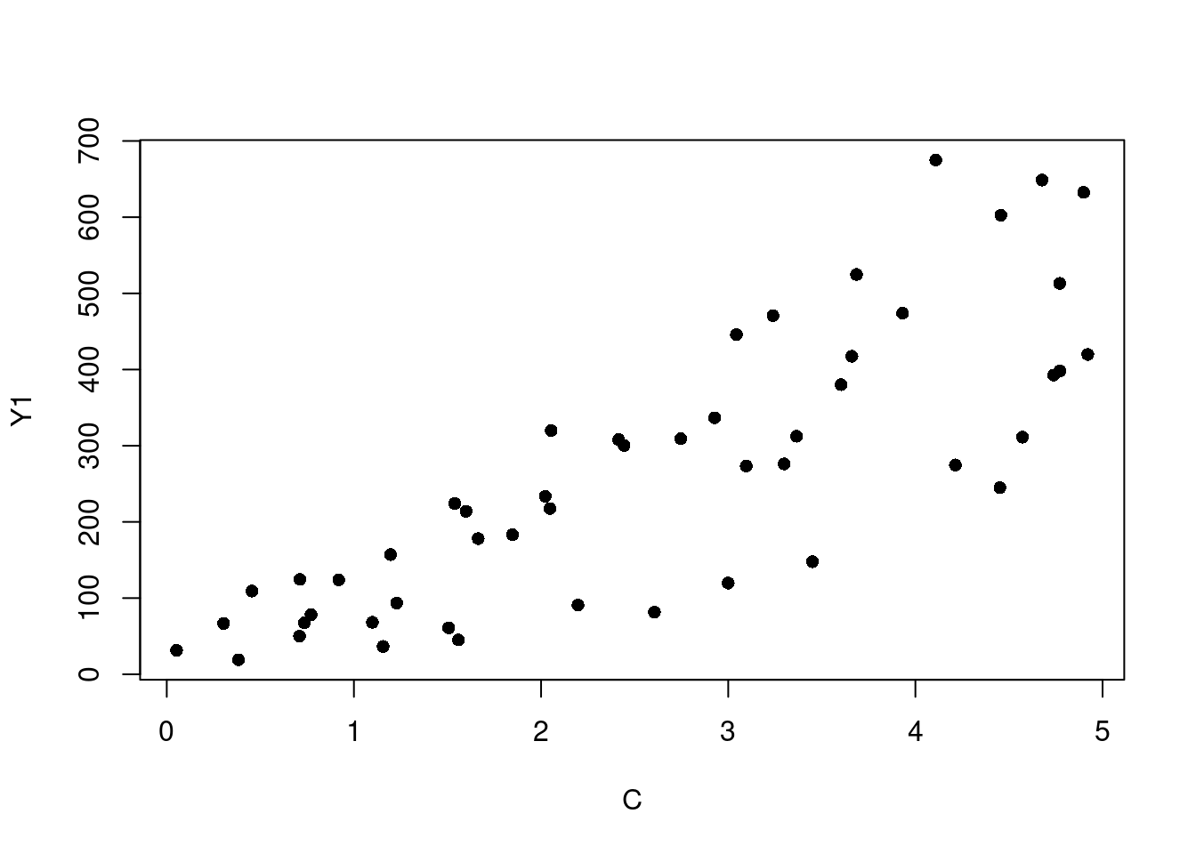
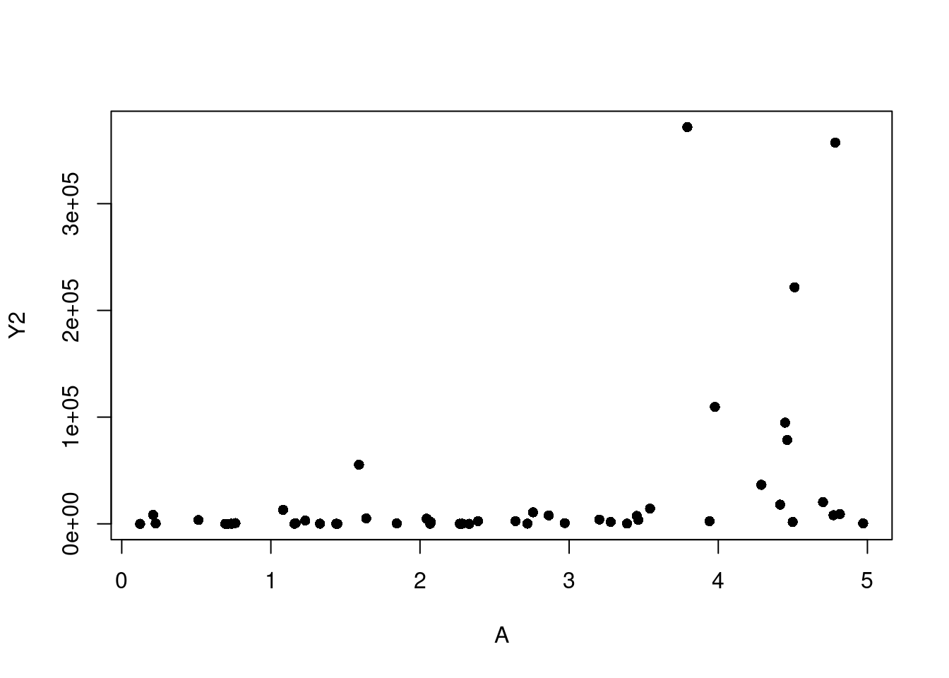
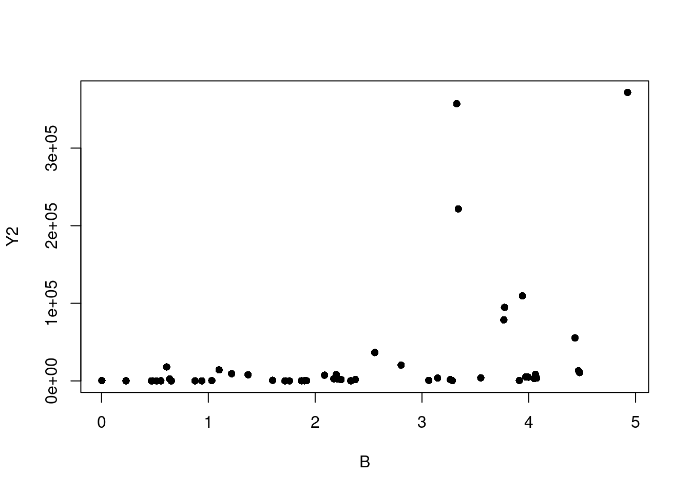
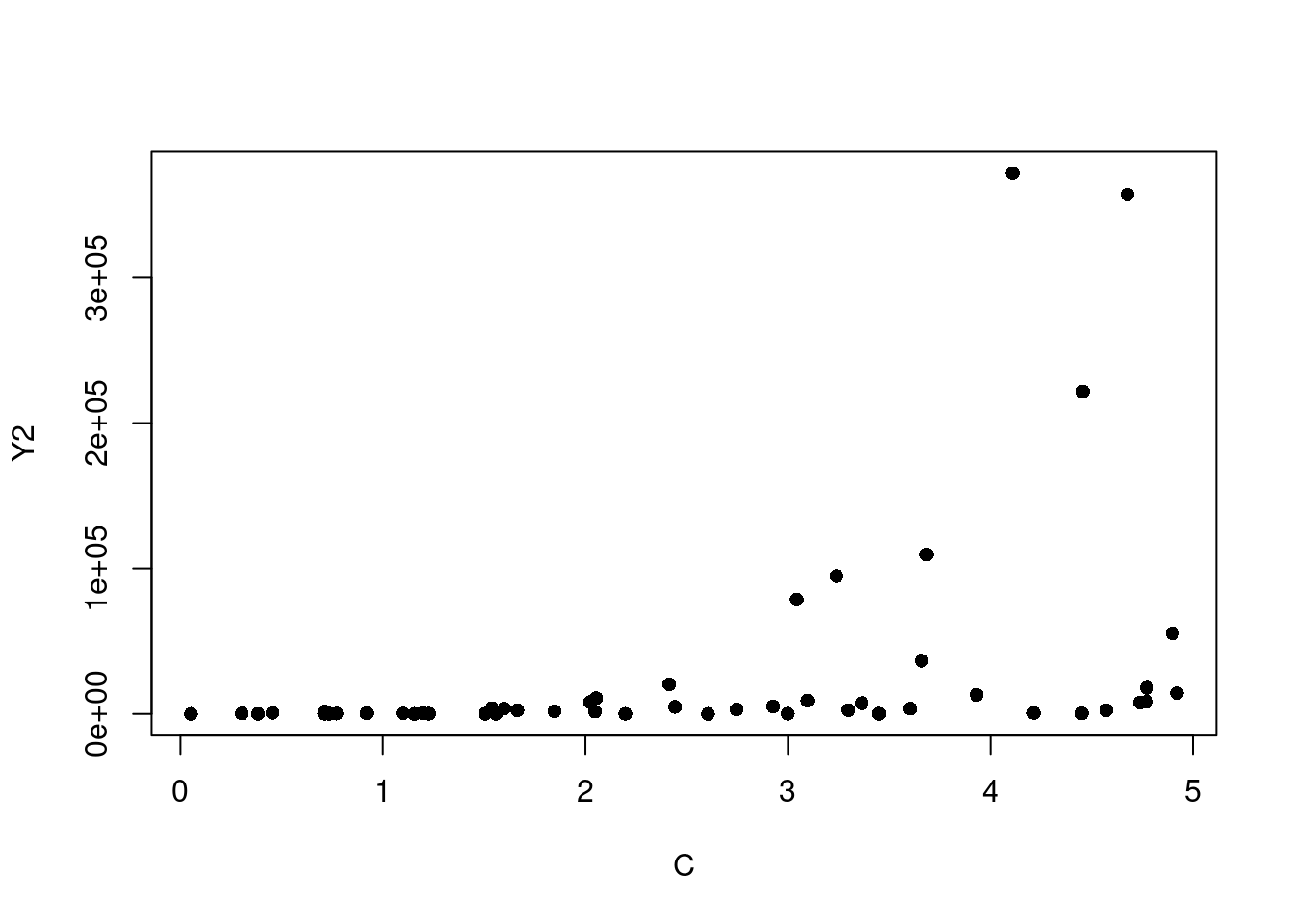
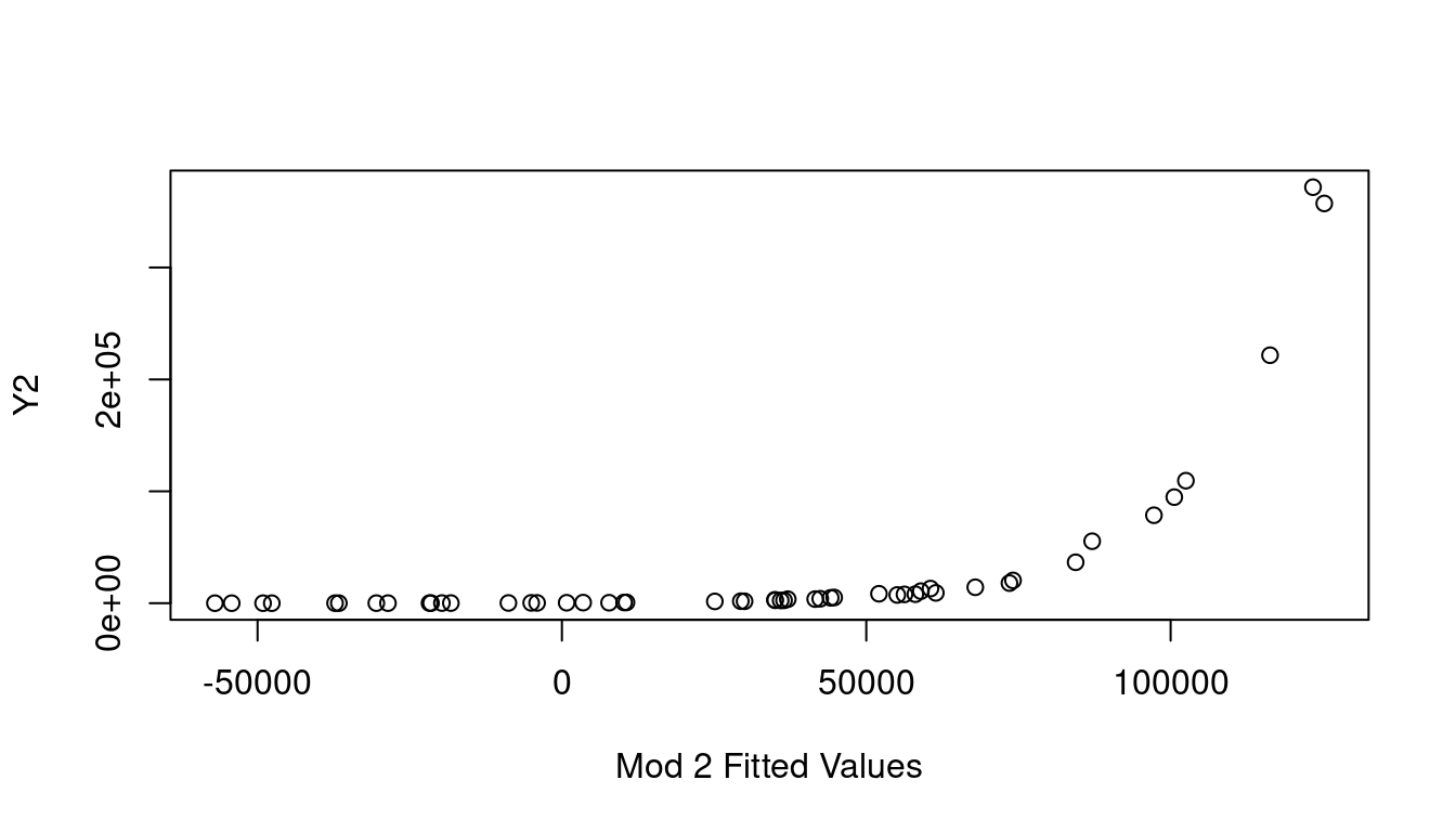
When in a situation where transforming Y is your best course of action, an Inverse Response Plot can help. For this we’ll create two dummy examples so the real relationship is fully known. Let’s create 50 rows of three independent columns, “A”, “B”, and “C”, where each is a created from a random sample from a Uniform[0,5]. Then we’ll make Y1 and Y2 where \(Y_1=(A+2B+3C)^2+\epsilon\) and \(Y_2=e^{A+B+C}+\epsilon\) using a Normal(0, 1) for the \(\epsilon\) noise component.
If we start by looking at simple plots of A, B, and C plotted against Y1, and against Y2, it is not immediately clear that transforming our Ys is what needs to happen (see Figure 7.16).
(a) A vs. Y1
(b) B vs. Y1
(c) C vs. Y1
(d) A vs. Y2
(e) B vs. Y2
(f) C vs. Y2
Figure 7.16: Simple Scatter Plots
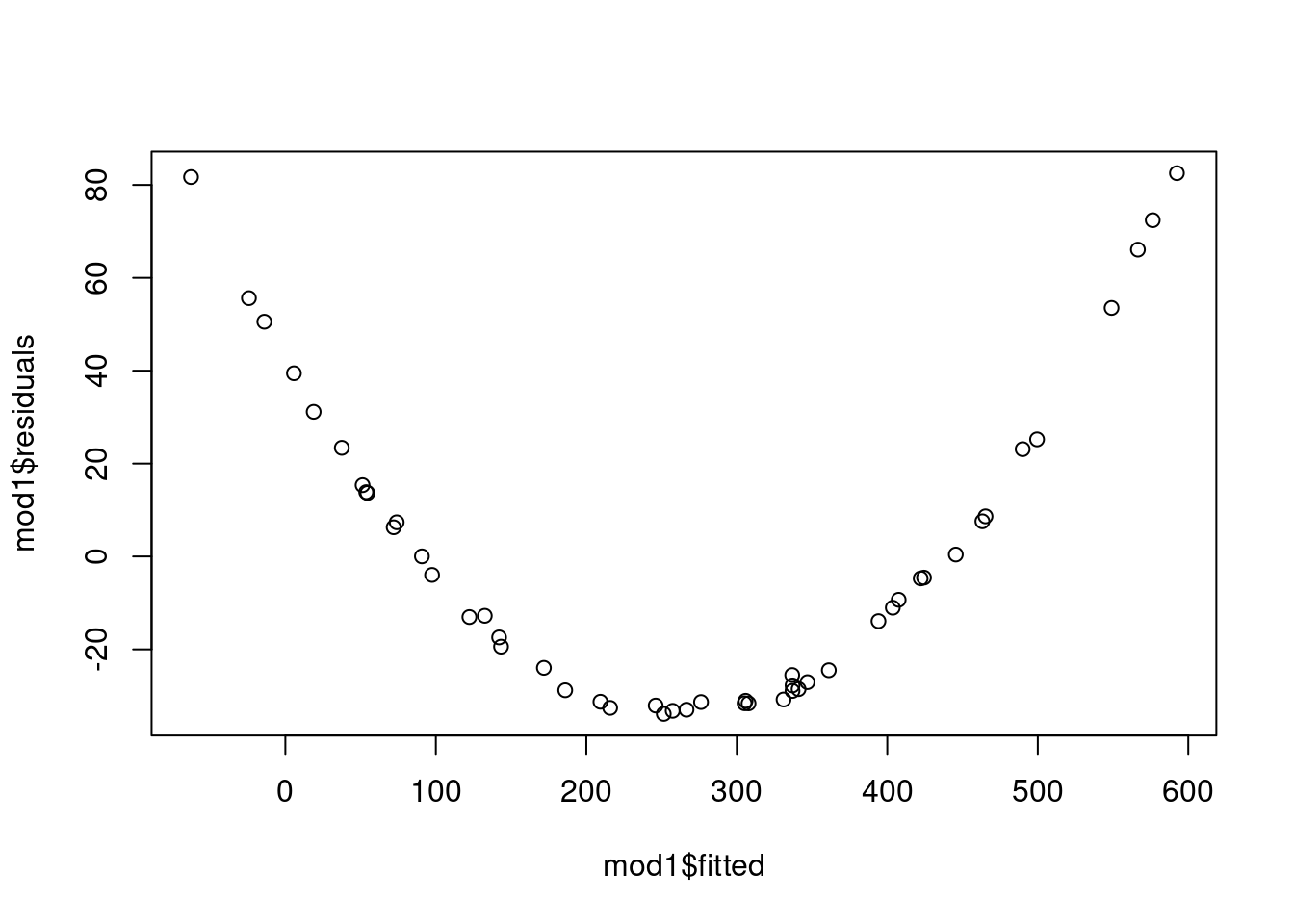
If we fit the basic models for Y1 and Y2 as functions of A, B, and C we get fitted vs. residual plots as shown in Figure 7.17 which clearly indicate there is a strong non-linear relationship at play and a transformation somewhere is warranted.
(a) Y1~A+B+C Fitted vs. Residual
(b) Y2~A+B+C Fitted vs. Residual
Figure 7.17: Fitted vs. Residuals
So let’s look at the partial residual plots for A, B, and C to find out where to transform. These are shown in Figure 7.18 and none look to have significant curvature in their pink line fits.
(a) A in model of Y1
(b) B in model of Y1
(c) C in model of Y1
(d) A in model of Y2
(e) B in model of Y2
(f) C in model of Y2
Figure 7.18: Partial Residual Plots
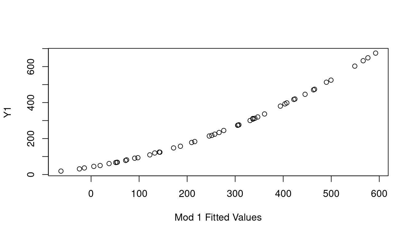
If none of the X predictor terms are the source, consider the response Y as needing the transformation by looking at a plot of the fitted value of Y on the x-axis, vs the observed Y values on the y-axis. This is called the Inverse Response Plot and if Y needs a transformation, the shape of the curve in the inverse response plot will tell you which one you need.
(a) Inverse Response Y1
(b) Inverse Response Y2
Figure 7.19: Inverse Response Plots
Sure enough, the inverse response plot for Y1 is a curve that follows an \(x^2\) curve shape which aligns with us needing to apply a square-root to Y1 to make it linear, and the inverse response plot for Y2 is a curve that follows an exponential curve shape indicating to us that a log transformation for Y2 is the way to go. Both just as our data was created.
7.6 Multicollinearity
When two or more independent variables are highly correlated with each other, your multiple regression model suffers from a problem known as multicollinearity. At issue is the fact that this correlation undermines the assumption that independent random variables are in fact independent, which is critical for accurately estimating their individual impacts on the dependent variable you’re predicting.
Sometimes multicollinearity arises because of a choice the modeler has made that is easily corrected. For example, in a health study rather than including both the weight of a patient and the patient body mass index, you can just select one as a measure of patient size and move on. Often though the choice isn’t quite so simple as the variables might very naturally move together while at the same time each providing valuable insight.
The problem is that having highly correlated independent variables makes the standard errors of the estimated regression coefficients increase. This means your confidence intervals are wider and you’re less able to identify when a term is significantly different from zero or any other key value of interest. Multicollinearity can also lead to coefficients changing notably, even changing signs unexpectedly, with relatively minor changes to the data or the model.
For an example, let’s look at the fgl data frame from the MASS library. This data frame considers the refractive index of 214 fragments of six different types of glass and their oxide makeup. We’ll start with the full model that includes all available predictors of refractive index:
mod_glass<-lm(RI~., data=fgl)summary(mod_glass)
Call:
lm(formula = RI ~ ., data = fgl)

Residuals:
    Min      1Q  Median      3Q     Max
-5.2131 -0.3786 -0.0186  0.3697  4.0317

Coefficients:
            Estimate Std. Error t value Pr(>|t|)
(Intercept) 11.68095   67.73022   0.172 0.863248
Na           0.60928    0.66840   0.912 0.363100
Mg           1.32017    0.67269   1.963 0.051086 .
Al          -0.92790    0.70416  -1.318 0.189098
Si          -0.61637    0.68460  -0.900 0.369022
K            0.74007    0.68789   1.076 0.283286
Ca           2.47150    0.66700   3.705 0.000273 ***
Ba           1.97569    0.70198   2.814 0.005374 **
Fe           0.36329    0.73879   0.492 0.623442
typeWinNF    0.09996    0.17352   0.576 0.565209
typeVeh     -0.88579    0.26111  -3.392 0.000835 ***
typeCon      0.39910    0.39687   1.006 0.315810
typeTabl     0.39263    0.42512   0.924 0.356822
typeHead     1.58234    0.43890   3.605 0.000394 ***
---
Signif. codes:  0 '***' 0.001 '**' 0.01 '*' 0.05 '.' 0.1 ' ' 1

Residual standard error: 0.9503 on 200 degrees of freedom
Multiple R-squared:  0.9081,    Adjusted R-squared:  0.9021
F-statistic:   152 on 13 and 200 DF,  p-value: < 2.2e-16
This model summary tells us a few things. First, you’ll notice that many of our independent variables do not appear significant - many p-values are well above any reasonable \(\alpha\) level. You can also see that two glass types that are most different from each other are vehicle window glass, with a -0.88579 slope and vehicle headlight glass with a 1.58 slope. This kind of makes sense that they would differ from the other types because the thick safety glass of vehicle windows is very different from the type of glass used to make regular home windows or tableware. Similarly, glass for headlights is also very different from your drinking glass but in an entirely different way. These observations aside though, the \(R^2=0.9081\) does indicate the model does a fairly good job at predicting the refractive index of glass given the glass components.
Now consider a reduced model that reduces glass type down to only three levels: vehicle, headlight, or other, and only considers the Al, Si, Ca, and Ba elements.
Call:
lm(formula = RI ~ Al + Si + Ca + Ba + vehicle + headlight, data = fgl)

Residuals:
    Min      1Q  Median      3Q     Max
-5.3816 -0.4509  0.0376  0.4418  3.9111

Coefficients:
               Estimate Std. Error t value Pr(>|t|)
(Intercept)   108.21998    7.34898  14.726  < 2e-16 ***
Al             -2.19413    0.17487 -12.547  < 2e-16 ***
Si             -1.61520    0.09887 -16.336  < 2e-16 ***
Ca              1.39476    0.05230  26.671  < 2e-16 ***
Ba              0.89572    0.20551   4.359 2.06e-05 ***
vehicleTRUE    -0.93091    0.26208  -3.552 0.000473 ***
headlightTRUE   0.63323    0.31455   2.013 0.045397 *
---
Signif. codes:  0 '***' 0.001 '**' 0.01 '*' 0.05 '.' 0.1 ' ' 1

Residual standard error: 1.015 on 207 degrees of freedom
Multiple R-squared:  0.8914,    Adjusted R-squared:  0.8883
F-statistic: 283.3 on 6 and 207 DF,  p-value: < 2.2e-16
Our intercept is wildly different now. What do you notice about the coefficients for Al, Si, Ca and Ba for the second model compared to the first? The Al and Si slopes are more than twice what they were in the earlier model while the Ca and Ba ones decreased significantly. And look at the standard errors on those new coefficient estimates. Our large model had standard errors that were all in the .66 to .74 range, but now they are much much smaller. Si went from having a standard error of 0.6846 to one of only .09887. The model coefficient of determination, \(R^2\), is only slightly decreased and still strong at 0.8941. What is going on here? Multicollinearity. Here is the correlation matrix (rounded to three decimal places) on our continuous independent variables:
round(cor(fgl[,2:9]),3)
       Na     Mg     Al     Si      K     Ca     Ba     Fe
Na  1.000 -0.274  0.157 -0.070 -0.266 -0.275  0.327 -0.241
Mg -0.274  1.000 -0.482 -0.166  0.005 -0.444 -0.492  0.083
Al  0.157 -0.482  1.000 -0.006  0.326 -0.260  0.479 -0.074
Si -0.070 -0.166 -0.006  1.000 -0.193 -0.209 -0.102 -0.094
K  -0.266  0.005  0.326 -0.193  1.000 -0.318 -0.043 -0.008
Ca -0.275 -0.444 -0.260 -0.209 -0.318  1.000 -0.113  0.125
Ba  0.327 -0.492  0.479 -0.102 -0.043 -0.113  1.000 -0.059
Fe -0.241  0.083 -0.074 -0.094 -0.008  0.125 -0.059  1.000
Looks like Mg is fairly strongly correlated with a few of the other terms. That’s why the model wasn’t hurt much by it’s removal.
In addition to checking correlation matrices, the variance inflation factor is a good metric for flagging where multicollinearity is likely an issue. The variance inflation factor is defined as:
\[
VIF_i=\frac{1}{1-R_i^2}
\]
Where \(R_i^2\) is the \(R^2\) from a regression model predicting variable \(i\) using all other predictors. So to examine the influence of Mg in our model we would look at how well Mg could be modeled linearly as a function of NA, Al, Si, K, Ca, Ba, Fe, and our two glass types:
Seems Mg can be almost entirely explained by the other terms. With a high \(R_{Mg}^2\), that means \(VIF_{Mg}\) will be large. In fact, \(\frac{1}{1-.9952}=208.42\). Values of \(VIF>5\) are generally considered to be worth a closer look.
In R
Fortunately, R will pretty easily provide you with all VIF metrics when provided with a full model under consideration. In the car library lives the vif function. Running all VIFs for our glass model is as simple as: